Articles
Ichimoku Kinko Hyo Charts: How Clouds Can Obfuscate, Yet Reveal by Nicole Elliott

Here’s another charting method that’s been around for decades, and yet can be brand-new to most Western audiences. Ichimoku kinko hyo is a method of technical analysis that has been around since before World War II, yet is virtually brand-new to most Western audiences. Why? Because textbooks on the subject have been, until recently, available only in Japanese.
I joined Mizuho Bank as a senior analyst 10 years ago. When I arrived, I realized much to my horror that all the Japanese dealers I would be working with were well up to speed with charts, and they used an incredibly complex method that I hadn’t a clue about. These charts looked like a writhing mass of multicolored, tangled spaghetti! But curiosity got the better of me. Risking the loss of face and career prospects, I approached the Japanese dealer who spoke the clearest English and asked him to explain. “Oh, these? They are cloud charts,” he said, “and we use them all the time.” And as I found out, Japanese dealers really do, and if you are trading anything yen-related I urge you not to ignore them.
THE BUILDING BLOCKS
The key concept behind the ichimoku method is that price and time are inextricably linked. Via laborious backtesting (by hand!), newspaper writer Goichi Hosoda (who used the pseudonym Ichimoku Sanjin) came up with four useful moving average–type lines before World War II, finally publishing a book on the subject in 1968. The lines are displaced forward and backward around the basic building block, which are daily candlesticks. These are used just as conventional bar charts: plotting trends, looking for patterns, areas of support and resistance, rever-sals, and so on.
The first two lines to be plotted are the nine- and 26-day moving averages. Do not use closing prices to calculate these. Instead, use the day’s midpoint (high plus low divided by two). When the shorter one is above the longer one, the trend is toward higher prices, and vice versa in a bear market, with the nine-day moving average plotted under the 26-day. So far, it’s easy. The number of days used, while optimized through extensive backtesting (without the help of even a calculator), is interesting. The 26-day reference is cultural; in addition to the five-day workweek, the Japanese financial markets previously were open on Saturday mornings but are no longer, so there are 26 working days in an average month for the technique.
The next line to plot is known as “leading” or senkou span A. It is the sum of the two averages, divided by two, plotted 26 days ahead of the last complete day’s trading. Leading/senkou span B is calculated by taking the highest price of the last 52 days (double 26), adding the lowest price over that period, and again dividing by two — same name but very different construction. The space between these two lines is shaded (in any color you choose) and forms the “cloud.”
The fifth and final line is chikou span (also known as the “lagging span”). It is the most recent closing price plotted 26 days ago. Note that the use of the English word “span” is deliberate. It denotes a certain length of time, which as mentioned is central to the method.
APPLYING THE BLOCKS
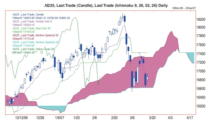
Now that you’ve been introduced to the building blocks, we shall examine how they are used, always in conjunction with each other. Look at Figure 1 carefully and make sure you know which line is which. You will realize that color really is essential when working with this type of chart. The solid blue daily candles represent days where the market closed below its opening price. The nine-day average is hugging the 16,929 level (at the time of writing). The 26-day average is horizontal at 17,416 so these point to a downward trend. Note, however, how well the light green one limited pullbacks on the rally until the end of February; you would have been long all the way up since November. These two averages are now resistance points for the index, just as they had been support on the way up.

FIGURE 1: TANGLED IN SPAGHETTI. Note the importance of color on these charts. From glancing at this chart you can understand why ichimoku charts are often referred to as “chart equlibrium at a glance.”
In March 2007 the Nikkei collapsed to the bottom of the cloud at 16,600, which stopped the rot neatly. This was an astoundingly strong support, especially considering the move started with a massive gap lower and is the biggest five-day decline in months. The subsequent bounce was capped by the top of the cloud at exactly 17,206, helped by the nine-day average. Then the index went back down again to senkou span B, which was holding at the moment. Often the candles will hover somewhere in the middle of the cloud for a few days before resuming their original trend.
Signals were mixed at that point because the averages were suggesting a move south, while the cloud indicated it would stem the decline and push it north later. If the candles were to break decisively below the bottom of the cloud, then the medium- to longer-term trend was to lower prices, no ques-tion about it!
Now let’s look at chikou span, the dark green line that lags behind. You will see that on January 29 and March 15, 2007, it was perched on the top of the cloud. This would have told you there was support at 16,600 on March 5 and at 16,800 on March 14. The lagging span also gained support and resis-tance from the candles themselves, especially their real bodies and if they were tightly bunched together. So on March 12 you would have known that resistance lay at 17,300, because that was where the low of the candle of February 5 was.
On March 15 and the following trading day there should have been resistance at 17,200 because that was where the candles’ lows were and should have impeded chikou span’s upside progress just as it did on February 5, 2007. Observe chikou span on January 4, 2007: the little candle offered support, allowing the index to rally after February 8, 2007. Mind you, it sliced through candles and averages, which were useless at the beginning of March.
Note also how the cloud got terribly thin on April 7, 2007. This was important as it was much less likely to offer either support or resistance when it is skinny. At these points there is a far greater chance of a turn in the medium-term trend. In addition, keep in mind that unlike oscillators, the distance between the candles and the cloud was not considered important. So while the index corrected lower at the beginning of January, it was not because the cloud was pulling it down because we strayed too far above it. A similar scenario can be seen in accelerated downtrends: the clouds can be an awful long way up, but this does not mean the instrument was oversold.
HERE’S MY PREDICTION
Because the cloud was so thick, we assumed it would stem the recent decline. Meanwhile, rallies were likely to be capped at 17,300–17,400 until April 20 by a combination of the following: top of the cloud; 26-day moving average; candles; and the nine- and 26-day averages up until February 13 to cap chikou span. From April 21 onward, I favored a rally. The reason was that both the lower and upper edges of the cloud started to rally smartly, and this was likely to limit the day’s low points. In turn it would cause the nine-day average to flip above the slower one, converting from a bearish to a bullish trend. On April 3, the top of the cloud suddenly dropped to meet the lower edge and these two crossed over. This crossover was not important unlike averages, but what was worrying was that it provided no support until mid-April. I would urge extreme caution, and profit-taking would certainly be warranted.
USING WEEKLY CHARTS
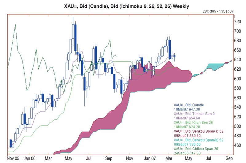
Spot gold (Figure 2) moved in a large triangle formation for almost a year. The nine- and 26-day moving average cross-over rule would have resulted in some serious whipsaws. They have been pointing to an upward trend since the start of this year, and though past performance is no indication of the future, if candles can start holding above the nine-day average, things should start looking bullish.

FIGURE 2: ICHIMOKU ON WEEKLY CHARTS. Here you can see how the candles hold neatly on the edges of the cloud, making it easy to identify support and resistance levels.
In this second example we have bent the rules and used weekly candlesticks rather than daily ones. You will see that these often work extremely well, having done a splendid job on equity indexes for several years. Here you can see how sometimes the candles hold neatly at the edge of the cloud and at other times they hover somewhere in the middle and then resume their trend. Note also how very far from the top of the cloud that prices managed to move, and giving them time to catch up, they pushed prices gently higher since October 2006. Note how the lower edge of the fat bit of the cloud was horizontal but then nudged higher, while the upper edge snaked its way either side of the $625 area. Note also how the cloud thinned in mid-May 2007 but then resumed its move higher. The large bearish engulfing candle this March from$688, similar to the one in June 2006, was a little negative and hinted at more work below for another few weeks. Note how the top of the cloud stemmed the latest decline.
Chikou span has had a dense forest of candles to contend with since May, so no wonder upside progress has been slow since October. Now at last it appeared to have a chance to hold above the candles and bounced from the nine-day moving average. With a little luck it will hold above the 26-day average for the next seven weeks, thereby keeping current prices of gold above $636 and the top of the cloud. If we should break below the average, then it ought to find support against the cloud and/or the nine-day average. So spot gold was unlikely to dip below the psychological $600 level.
TANGLED SPAGHETTI?
Ichimoku charts serve multiple purposes. They can be used to identify support and resistance levels, they can be used as trend indicators, and they can show the strength of buy or sell signals. As we have seen here they are excellent forecasting tools. So even though they may look like a writhing mass of multicolored, tangled spaghetti, they have a lot to tell us.
