Articles
Trading Trendline Breaks (Part 1) : Using Trendlines For Trading By Sylvain Vervoort
One of the best trading methods in technical analysis is the application of trendline breaks. Find out why. I am convinced that one of the best trading methods using technical analysis is the application of trendline breaks. Let me convince you too. Let’s start off by discussing the differences and similarities of linear and logarithmic scaling. First of all, take a look at your charts. Are they linear both horizontally for the time setting and vertically for the price setting? Or do you have to use a semilogarithmic scale with a linear scaling on the time axis and a logarithmic scaling on the price axis?
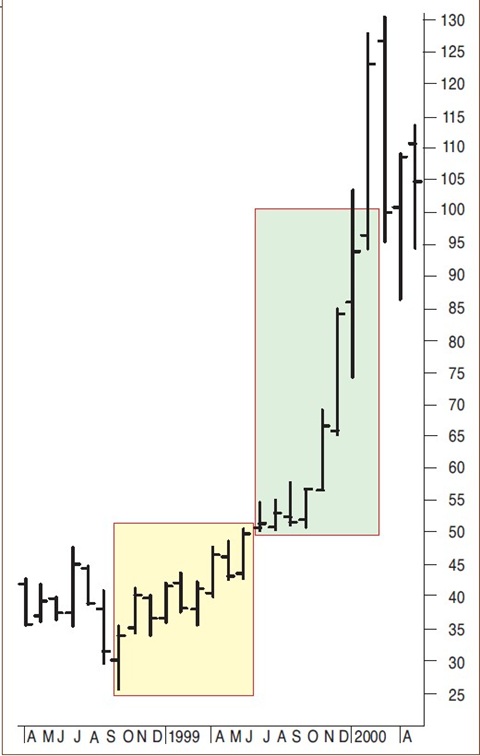
Linear scaling: If you are using a division of five points on the linear scaling, then for a price change from $25 to $50 there are five divisions. For a price change from $50 to $100 there are 10 divisions. This means that the distance on the vertical axis from $50 to $100 is twice as large as the one from $25 to $50 (Figure 1).
- FIGURE 1: LINEAR SCALING. When using a linear scaled chart, the price move between $25 to $50 is five units and from $50 to $100 is 50 units. However, the percent change between the two moves is the same.
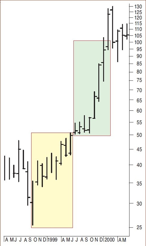
- FIGURE 2: LOGARITHMIC SCALING. In a logarithmic scaled chart, the price moves of those in Figure 1 will be the same.
On the other hand, a price change from $25 to $50 or from$50 to $100 both equal a 100% price increase. A price moving from $5 to $10 or from $100 to $105 is the same distance on a linear scale. It is clear that this does not give a good visual impression of what the price movement really represents. Moving from $5 to $10 is a 100% price increase, but from $100 to $105 is only a 5% increase.
Semilogarithmic scaling: To have the same distance on the vertical scale representing equal percent changes, you can use a logarithmic scaling (Figure 2). We actually call it a semilogarithmic scaling because there is a linear time scale on the horizontal axis and a logarithmic price scale on the vertical axis. This means that the distance on the vertical axis from $50 to $100 is now the same as the one from $25 to $50, namely a 100% price increase. This gives a much better visual impression of charts with large price moves.
A five-point increase from $25 to $30, a 20% move up, is now double the distance compared with $50 to $55, a 10% move. The logarithmic scale allows you to compare details in a more meaningful way when prices vary over a bigger range. For a chart with small overall price changes, up to 50% or even more, the difference between a linear scale and a logarithmic one will hardly be visible on the screen.
TRENDLINES ON A LOGARITHMIC SCALE
The monthly chart in Figure 3 demonstrates that when there are large price moves, applying a linear scale can be a disadvantage. It is simply not possible to draw a trendline under the up move from 1996 to 2000. When you use a logarithmic trendline (red curve), the price finds support on this trendline. Compare this to the linear green line that is drawn between the same start and endpoint as the logarithmic curve.
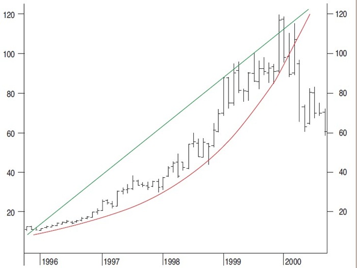
FIGURE 3: LOGARITHMIC AND LINEAR TRENDLINE ON A LINEAR SCALE, MONTHLY. When using a linear scale, it is impossible to draw a significant trendline. However, the logarithmic trendline does a good job at acting as a support level.
In Figure 4 you see the same chart, but this time it’s using a logarithmic scale on the vertical axis. It is no longer a problem to have the green linear trendline under the monthly price move from 1996 till 2000. The red logarithmic curve is now also a straight line because the logarithmic scale on the vertical axis compensates the logarithmic curve of the trendline. The correct choice seems to be using a logarithmic scale on the charts. This gives you the ability to use linear trendlines without a problem. There is, however, a serious disadvantage.
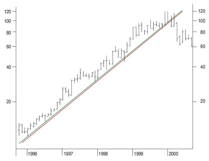
FIGURE 4: LOGARITHMIC AND LINEAR TRENDLINE ON A LOGARITHMIC SCALE. When using a logarithmic scale, the linear and logarithmic trendlines clearly identify the long-term trend.
Take a look at Figure 5. Both the linear and logarithmic trendlines were moved up to determine if they can form a trend channel. This works well with the red logarithmic trendline because it is compensated at every level by the logarithmic vertical axis scaling. But this is not the case for the linear trendline.
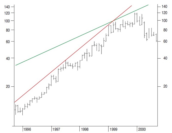
FIGURE 5: MOVING THE TRENDLINES. When the linear and logarithmic trendlines have been moved up, you can see that the logarithmic trendline will more accurately display the price channel.
Moving the linear trendline will change the inclination of that line because it is moving into a different price range. So the correct thing to do is use a logarithmic trendline on a logarithmic price chart. Nevertheless, most people will use linear scaling on daily price charts, which is all right as long as the price moves within limits. More often, logarithmic scaling is applied to longer-term charts such as weekly or monthly charts, mainly because the price moves are more significant. The correct solution would be to use all the time logarithmic price charts with logarithmic trendlines.
Next time, I’ll discuss trendlines in more detail.
Sylvain Vervoort lives in the Flemish part of Belgium and is a retired electronics engineer who has been studying and using technical analysis for more than 30 years. He is an independent trader, writer, publisher (in Dutch), and educator in technical analysis and options.

